May 2023
Munchie
 This semester I had the opportunity to work on a startup project together with 5 other students. It was an idea that I've had for a while, and I was really excited to finally get the chance to work on it. The idea is to create a website that helps you and your friends match what you want to have for dinner.
The team consists of:
- Me (project lead, lead frontend developer, and designer)
- A product owner
- Another frontend developer
- A backend developer
- A backend developer / AI specialist
- Another AI specialist
The project is still in its early stages, but we have a working prototype that we are currently testing with friends and family.
The website, it's designs, and this article, are a work in progress
The idea
The idea is to create a website that helps you and your friends match what you want to have for dinner. You can create a group with your friends, and then you get recipes that you can swipe left or right to like or dislike them. The website will then match the dishes that you and your friends have swiped, and then it will show a match that you all want to have for dinner.
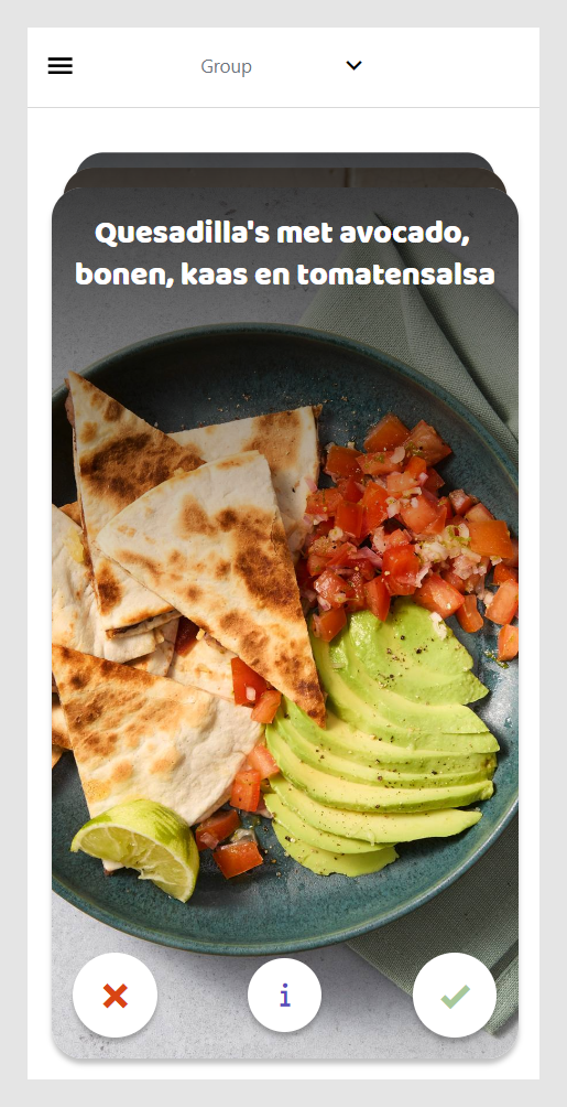
The design
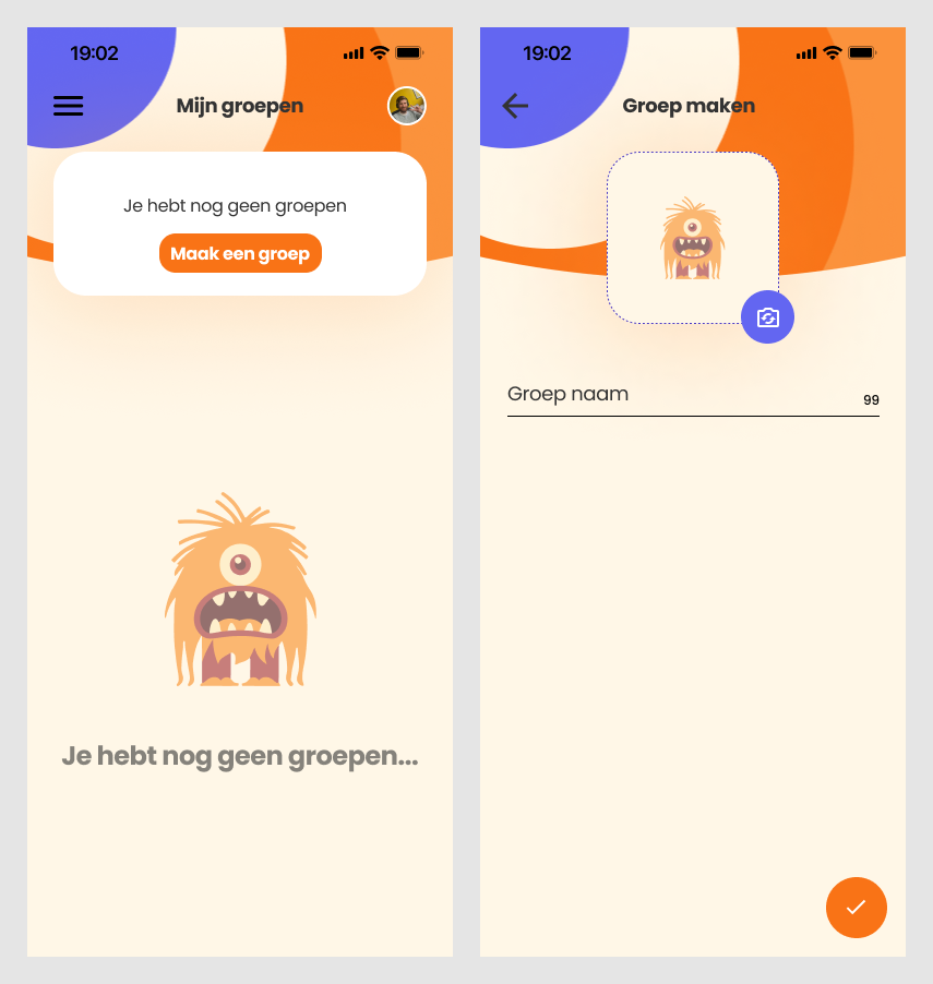
I've designed the website in Figma together with the product owner. We've tried to keep the design simple and fun, and we've tried to make it as easy as possible to use. We identified the minimum viable product, and then we designed the website around that, ensuring that the user can use the most important features without any problems. The first thing that the user can do is to create a group, and then they can invite their friends to join the group. I've designed these two screens:
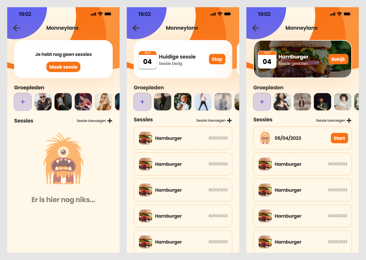
I also designed what the group screen looks like when you have joined or created a group. At the top it shows swiping sessions for days that have not yet passed. Underneath that it shows a list of all the users that are part of your group. At the bottom it shows a list of all the sessions that have been made in this group. The user can click on a session to see the results of that session.
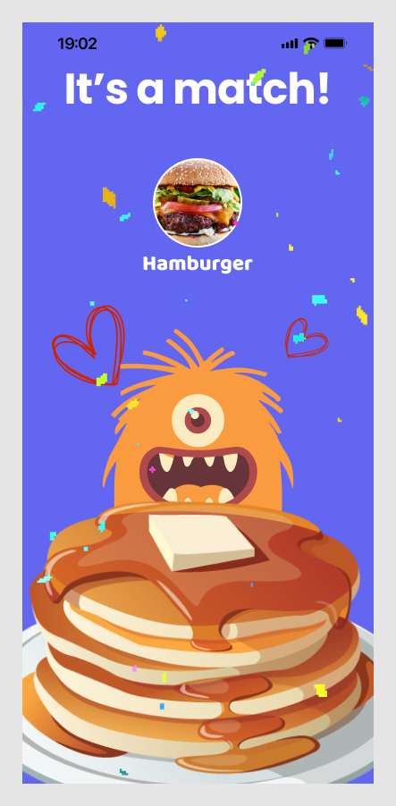
And lastly i designed the screen that shows up when you have a match with your friends.
The development
As both the project lead and the lead frontend developer, I have both the responsibility to think ahead and make sure that the project is moving forward, while also making sure that we don't get overwhelmed by the amount of work that needs to be done. I've been responsible for the development of the website. I've been working closely with the product owner to make sure that the website is developed according to the designs. I've also been working closely with the backend developers to make sure that the frontend and the backend work well together. I've also been working closely with the other frontend developer to make sure that we are on the same page, and that we are developing the website in the same way.
The website is built with React Native using typescript, and we are using Expo to build the app. I chose to use React Native because I wanted to learn to use it, and because I eventually want to make the website into an app as well. I chose to use Expo because it makes it easy to build the app, and because it makes it easy to test the app on my phone and deploy it later on in the project.
We also use the following libraries:
- React Navigation for navigation
- react-native-deck-swiper for the swipe cards
- swr for fetching data
- twrnc for using tailwind css in react native
- eslint for linting
- prettier for formatting
- husky for running scripts before commits
We use a websocket to communicate with the backend, so that we can get real time updates when a user swipes a card. For managing the state of the app we use the React context api.
Setting up these libraries and implementing them, as well as the websocket and the context api, was my responsibility. I also implemented the swiping functionality.